Thursday, June 2, 2011

Andrew+M+03

It’s surprising to think that better visuals of life threatening data could have saved the lives of those on the Challenger mission. It’s also important to recognize that the information presented by the engineers was compiled by people who are extremely specialized in their field. This is to say, that any opportunity for the engineers to gain knowledge was most likely spent on the subject of engineering. Specialization is an ever-growing phenomenon in our technologically advanced society, which is vital to our continued advancement and manufacturing capabilities. In the time of da Vinci, a person could be a scientist and an artist; however, it now takes so long for specialized people to acquire their knowledge that they do not have time to diversify their subject matter. Of those engineers, some probably specialized in material science, of those a few specialized in metallurgy and then even of those some probably focused on particular metals and then of those some were specialized on the effects of heat, stress, conductibility or other properties of metal.

The specialization of modern society has dramatic positive and negative outcomes. The ability to focus our collective human knowledge as a collective of intelligent individuals lets us solve extremely complex problems, like launching rockets into space. However, specialization produces an individual who is so committed and focused on one very specific area of expertise that other areas of knowledge are disregarded, even the ability to communicate effectively. This does pose the question of why Thiokol did not have specialized personal who’s task it would have been to communicate between their technical personal and the outside world.

A company I worked for a few years ago, North American BioIndustries, had a problem with specialization; they had several departments with people who were very good at doing their specific jobs but could not communicate effectively between departments. The company created their own chemical formulas through their chemists, had a sales department to sell directly to customers and also manufactured the product themselves. Each department also had more departments under it and because of the lack of communication many projects were delayed simply because the company did not know the status of a project. It was amazing to see people constantly saying that they passed the purchase orders on to someone else, which may or may not have been the correct person.

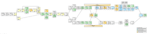
I was given the task of making a flow chart of how a product comes to be, how it is formulated, tested, sold, manufactured, shipped, billed and everything in between. I produced a one-foot tall by three feet long, color coded, flow chart of every department sometimes including specific job positions and arranged them in the order a project should follow. I did not institute any standards or rules; I just asked people where a project came from and who they pasted it on to; this laid it all out for them to understand how everyone is connected. It was a crude PowerPoint flowchart but they could finally see the process and realize that no one department was the center of the company. They even printed out several copies, framed them and hung them in the halls; the company eventually went out of business regardless.

The Challenger disaster and my job experience has shown me how highly intelligent people can be so focused in their particular field that common sense or the ability to communicate can be degraded and ignored while striving to be the best in one particular area.

GordonGR03

Information Design ~ Day 3 Let’s not get too serious about designing charts and graphs – this isn’t a life or death deal… or is it?

Ok, for some art directors and designers, they might act like it is. But they will be back tomorrow to draw their lines and have their turf wars over the next great graphic injustice or client alteration. Today’s reading lesson from Visual and Statistical Thinking shared the tragic recount of the Space Shuttle Challenger accident and the role that charts and graphs played in the decision of “go” or “no go” for the scheduled mission. These decisions would forecast the fate of life and ultimate death for seven people. Now to be fair, this critical decision to move forward with the launch was not solely based on some charts. Thirteen charts designed by rocket scientists to be exact. There were influencing factors from several key sides all weighing in heavy on the decision makers. These decision makers were a group of high ranking NASA officials. And the influencing factors were all legitimate pressure points. Sadly, what was lost in the mix of “determinating” factors was the humanity of it all – literally and physically.

The rocket-maker Morton Thiokol and NASA may have been skewed in their perception of these missions becoming predictably mundane. Who knows – maybe a bit of pride and arrogance got in the way as well. There were outside political pressures and bureaucratic reputations to uphold. Huge T.V. broadcast schedules and PR events were in motion. An enormous audience wanted to see a teacher in space… the show had to go on. So what was the problem and why the need to weigh all these factors? This was just the Shuttle after all – one more launch to chalk up and add to the previous 24. Truth is this one was a first. This was the first time a shuttle launch would have to contend with temperatures below freezing. This is where charts and graphs were to be used to reveal the true risk factors. Charts and graphs as tools, delivering clear, concise compelling data. Information Design was about to be put to the ultimate test. Would these 13 charts and graphs deliver “the humanity inside the information”? Sadly, we know the answer. The graphs with their lack of authorship, cluttered data and overall chartjunk were not the caliber of support materials needed for such a critical deliberation. Hind sight is 20/20 and we are all aware of the historical outcomes from this horrible accident. I would like to think that we can learn from the past. The power of properly delivered data incorporating the principles of solid information design can be life and death stuff. What an awesome responsibility – as a designer and a person.

In keeping with the heavy theme of the day, we next were treated to Ray and Charles Eames short film- Powers of Ten. This cinematic gem made me feel small and could also instill the feeling of being the center of the universe – heavy! The film gracefully combined the principles of color, value, shape and size. The film served as an inspiration – not only in its message but also in its art form. I had never seen it before and plan on sharing it with…. um, everyone.
Equally fascinating was the TED of the day: Multitasking - Aaron Koblin. I found his passion for data and design to be contagious. I plan on viewing his segment several more times and may take a shot at illustrating a scene for his interactive music video - the Johnny Cash Project myself.

Paul-A-R03

The Decision to Launch the Space Shuttle Challenger

The destruction of the space shuttle Challenger was as much a failure in the decision making process as it was a mechanical failure of a rocket component. Several factors played a part leading to the fatal decision to launch the rocket despite concerns about the negative effects that the cold weather might have on a successful launch. Among these factors are:
1. The failure to gather and analyze all of the relevant data needed to make a sound decision
2. The failure to present the data arguing against a launch in a clear and concise manner
3. Outside pressures to make a quick decision that did not place the safety of the crew as its highest priority.
The first two items are relevant to information design. The last is a political question.

When analyzing data it is important to have as much data present as possible so that comparisons can be made and patterns can be recognized. The 13 charts that were prepared to support cancelling the launch never presented all of the relevant information in one chart or graph. Instead information on rocket tests, o-ring failure and temperature of the o-rings at ignition was spread out among various charts. The data was not consistent. Rocket engines had three different designations making it difficult to identify which engines were being referred to. Not all of the data was included in all of the charts. In some cases only the data that showed wear or failure was included. As a result it was not possible to compare this data with the results of many other successful tests and flights to establish the pattern of failure due to the temperature of the o-rings. The causal link to temperature was not clearly established based on the data that was selected.

From the standpoint of information design the data was not clearly presented. The pre-launch data was delivered as written reports or as charts with columns of data. They required intensive scrutiny to understand the data or recommendations that were being presented. Data was ordered by engine designation with no attempt to sort the data by other relevant factors such as o-ring wear or temperature. Temperature was never emphasized in the charts as a cause of the o-ring failure.

The post-disaster graphics were equally poorly designed. The use of rocket icons made the data maps difficult to read. There was little visual contrast between the icons and the data presented. Grids of rocket icons, while making the graphic more accessible to a non-technician, created clutter and noise. The interaction of the many vertical lines causes flashing in the negative spaces distracting the viewer from the data. The use of shading and cross-hatching in keyed symbols for wear and failure was not sequential. The value of the shading did not correspond to a greater or lesser degree of wear or failure. Furthermore there was no attempt to arrange the data according to degrees of wear or temperature when presenting the visual data.

The launch of the space shuttle Challenger was planned as a media event to be viewed by the whole nation. Many resources were committed to covering the launch. Due to political and economic pressures the launch was going to proceed as planned unless very strong evidence could be brought forward to prevent it. Unfortunately, although the data was available to do so, whether due to time constraints or lack of skill, the presentation of the data failed to have what might have been a life-saving impact.

Hyrom-S-R03

After viewing the case study of The Challenger, and its devastating accident which left 7 dead, I couldn’t help but get angry, upset, and disappointed at the upper official NASA staff responsible for approving the take off of the craft. Why did this happen? I Guess people didn’t care about people back then, yeah right. A human life is way more important than some chance to gather information. I mean, just think of what was and am at stake if the government continues to make decisions like these. This flaw can go a long way. These dangerous paths include wars, bill passing, and government experiments such as jet streams. I’m going to keep it real right now. Uncle Sam, I’m tired of you being controlled by Satan, believing you got control over citizens, doing whatever you feel. You are not God almighty, no matter what the lies from hell tell you. Everyone has to reap what they so. This was ridicules, the evidence of the possible occurrence of an accident was presented to the decision making individuals of NASA, which of course is linked to our dear government. NASA, may King Jesus Christ have his way with thee. I am an African American from the inner-city, and I grew up in deep poverty my whole life, I know government trash when I smell it. That’s what I think about the Challenger accident, not of its victims, God rest their souls, but the officials responsible. Say, Uncle Sam, something got to shake! Stop making dumb decisions like these or your destruction will come up on you like a thief in the night. This is going to happen anyway, so therefore, repent and make better decisions. Also, your decision to invade Libya on Omar Khadafe is another bad strike of the beatings you are going to receive in the Day of Judgment. I pray for your Uncle Sam, seriously, that you don’t become a rolling stone. In many parts of the world in which you have “laid your hat”, they are not your home! God have a way of warning nations, and this is one of them. Wait, big brother is watching me, NASA don’t let this happen again. I believe that this event serve to us all a deep purpose. This purpose includes close inspection before a very hazardous decision is made. Why waste time trying to please the crowd when an opportunity of discovery is available. The probability of another discovery that could have been discovered by the Challenger’s crew was possible. Now only time will tell when it comes to the potential that close decision making can bring about. I don’t believe that the provision of some cluttered graphs was enough to send a preventable mistake outer space. Yet, that’s the pass, there’s no way we can go back in time and change this mishap the only thing we can do as a nation, is learn from this sad event and prevent its occurrence. NASA, turn off the telescope and hug your neighbor, you might need him/her some day.

Sam K R03

How does one quantify a human life? This is a question I’ve been asking myself recently, in relation to my final project. In the case of the Challenger and those who tried to graph out the dangers of launch, how does one quantify the loss of a human life? Above all media attention, all expensive shuttle parts, and any planned presidential conversations, these human lives were the most devastating of losses when those O-rings failed.

Tufte places most of the blame for this unheeded failure on those who tried to communicate the potential danger. These scientists, as correct as they were with their assessment, created awful and almost incomprehensible infographics to support their claims. In their “History of O-ring Temperatures”, they used a very limited data set, in which the damaged O-ring examples outnumbered the undamaged ones. I can understand why they would use this small dataset if they were making a case for redesigning their O-rings. However, they were comparing damage to launch day temperature, so the number of damaged O-rings shouldn’t have mattered to them because in this case, every single one launched at below 53 degrees F were damaged. This data would be moving enough if shown side-by-side with other launches at higher temperatures, as Tufte shows in his redesign. However, even then, the designers would have to explain how they quantified damage.

To further improve this infographic, I would suggest putting this O-ring damage into a relatable perspective. Surly there were other things at risk, or actually damaged, in these launchings of cold O-rings. Could they have also been quantified, in comparison with what would be lost from the Challenger? Was previous O-ring damage documented with photographs or notation? Could those have been included, to give the charts credibility and context?

It doesn’t surprise me that the administration did not understand or believe the warnings that these scientists were giving them. They obviously did not know how to compose an infographic, or to even explain how they work to their administration. However, I believe that other odds were at work when their ideas were turned down. There was a lot of political and social pressure to launch it, and I wonder if the administration believed too strongly in their project’s success—so much that they couldn’t see its errors. It was easy enough for the media and the world to understand how cold effects the O-rings when the scientist put it in ice-water on television. They already knew that there was an error with the O-rings—so yes, of course, if the scientist says it becomes less elastic in ice-water, it’s completely believable. Tufte is quick to point out the error in this experiment. As an isolated incident, without any comparisons made, it gives incomplete data. The O-rings on the ship weren’t even submerged in water, so can it truly relate back to the failed launch? I think not, but people were quick to accept this as an honest, full explanation, anyway.

All said, the conclusions drawn from experiments done for this situation were examples of people seeing whatever they wanted to see, blind to their own mistaken science and equally deaf to what others were trying ­to communicate.

Kate+D+R03

This article opened my eyes to the importance of effective communication through charts and graphs. A catastrophic event could have been avoided had the engineers better communicated their concerns of launching The Challenger. We can also take in to count that the scientists were ignored by NASA administration but had their data been presented in a stronger way their chances of being ignored would have gone down. That also then led me to think about my own communication and how effective and ineffective it can be. For example, when going on an interview how can I better present myself to the possible employer? I might have strong skills in a certain area but if I do not properly communicate them it could ruin my chances of being offered the job. Working in a creative field means showing a portfolio to a prospective employer and while I may not be displaying a chart or graph of my work how can I utilize the idea of effective graphing in how I choose to present my work. People, especially those having a high level of authority, are always going to be skeptical of the information you are presenting them unless you can present to them a seemingly airtight argument. Although the engineers of The Challenger had good reason to believe a launch would not be right due to the temperatures, their lack of effective communication made NASA doubt them, ultimately leading to their decision to launch the rocket anyway.
Another thing that stood out to me was the use of appropriate comparisons when presenting data and how I can apply that to my own life. Using the example of interviewing for a job and presenting a portfolio, how can I compare my work in a way that shows growth and understanding on a higher level? Just comparing work from my first year of college to my last year wouldn’t showcase the level of growth through the years it would merely show that yes, I learned something in college. It’s interesting to me how an article about The Challenger can be applied to events in my own life like this. I’ve never spent much time thinking about communication other than the basics, but as I prepare to reach out into my field of interest effective communication is going to play a huge role.

Rachel+H+R01

Because I switched the two readings around I got the rare opportunity to hear the class talk about the first reading before actually reading it. The discussion on the reading didn't make a whole lot of sense to me yesterday; however, once I read the chapter I think I got a lot more out of it because of the background knowledge I received during class. In class today when I was handed the map/chart/timeline of Napoleon's Russian campaign by Charles Joeseph Minard it was the first time I had ever seen it so I was able to try and dissect and analyze it simply based on the orange and black line, the title, and the numbers. I thought that it was very successful and visually interesting to have the line weight measure and correlate to the amount of soldiers throughout the march and the retreat.

I was surprised at how much information and narrative could be pulled out and created from a map, especially one where the main dialog was written in French. Although I'm sure it would have come a lot faster to me if I had read the paragraph in our reading about the map.

The reading was very informational and a lot more interesting to me than I would have thought. I was glad to get an overview and a little history on the art of graph/chart making as I know it is important to understand where a medium came from before you can dive in to try and do it on your own. I was also pleased with the variety of charts shown in this reading, the more styles that I see between the two readings the better I can start to formulate my own plans and ideas for my final project.

I would consider myself a layperson when it comes to any sort of graphic design, sure I can tell you if there is a bad design but to distinguish what exactly makes it poor I would have some trouble. McCandless said in the TED talk, that he didn't need schooling or formal training in graphic design because he is surrounded by design everyday and because of that somehow he innately knows how to design. I myself am wondering if I too could just start making my own visual organizers without any schooling. I know for sure that this is not the case as I have now looked back at my own art and the posters/bulletin boards I have created and I notice several of the mistakes pointed out in the two articles that make the information hard to receive. I never realized there were so many rules and guidelines, normally I think it is okay to break rules, especially when it comes to art, but now I am seeing that the rules for design have reasons and they really make sense. I am excited to see what this class will bring out in me and to see if I can come up with a successful design that will present information clearly to the receiver.

KarenR_R02

I found today’s reading to be informative and useful. This is the first class I have ever taken in the field of graphic design. Much of this is new to me, but I find it fascinating. I know bad design when I see it, but how to correct it is not always obvious. A chart with a lot of information that is not properly layered and separated is useless. If it takes someone longer than a split second to interpret the chart and find what there looking for, they give up, they shut-down. It is crucial to elicit cognition in that first glance.

In this reading, there were several charts that were shown with poor design, given a critical evaluation, and then redesigned to be more effective. The changes made to them were usually subtle, and always simple, but the differences before and after were very apparent. It is refreshing to me that problems in communication can be solved with such modesty and ease.

Albers’ principle of 1 + 1 = 3 was a new way of thinking about things I already knew. I was always aware of negative space, but it is definitely easy to ignore. I had never before given a concrete value, a number, to the interaction of two elements on a page. Something about having the equation that appears at first as a contradiction gave me clarity and solidified knowledge I already had.

I enjoyed the video we watched in class with David McCandless. I like people with success stories that do not include a lot of schooling. I do not believe there is anything taught in a classroom that cannot be acquired by the inquisitive mind. He is right in saying that we all have an intuitive knowledge of design by virtue of the fact that we are surrounded by it.